





Your product uses the same chipset, the same battery cells and often the same factory as the one next to it on the listing page. The spec sheet says so, and so does the reviewer who opens both boxes on camera. In consumer electronics the engineering gap between brands has narrowed to almost nothing, and the brand gap is where the margin now lives. A consumer electronics marketing agency has to start from that uncomfortable truth, not paper over it with bigger numbers.
We work with electronics brands launching their first product and with established ones adding a new category. Phone accessories and chargers, earbuds and smartwatches, smart home devices and kitchen appliances, gaming and PC peripherals. The categories behave differently, which is why each has its own page below. The pressures they share are the subject of this one.
Why do electronics brands all look the same?
Because they all start from the spec sheet. Forty-hour battery, 50 millimetre drivers, 65 watt fast charge, IP67. Every brand leads with the same five numbers, sets them in the same thin sans serif over the same dark gradient, and wonders why nobody remembers the name.
Numbers still matter. Buyers check them. But numbers are the entry ticket, and your competitor will match them next quarter. What they cannot match overnight is a clear point of view: who the product is really for, what it refuses to do, the one experience it gets right that others treat as a footnote. We build an electronics brand around that point of view first, then let the specs prove it. The brand strategy work is short and practical, and it ends in words your product manager, your listing copy and your reviewer briefing can all use.
Tech product launch agency, working to a date that will not move
Electronics launches run on someone else’s calendar. The festive sales window, back to school, a flagship phone announcement that makes last year’s accessories obsolete, a trade show booked eleven months ago. The factory ships when it ships, and marketing has to be ready anyway.
We plan a launch backwards from the date, and we build the assets in the order the market will see them. The reviewer kit goes before the billboard. The listing goes live before the film has its final cut. A typical plan looks like this:
| Weeks before launch | What happens | What is ready |
|---|---|---|
| 12 to 10 | Positioning, naming, key message, pack architecture | The sentence and the product name |
| 10 to 7 | Packaging design, hero photography or Studio renders, film script | Print-ready artwork sent to your converter |
| 7 to 4 | Listing image sets, product page, reviewer kit, creator briefs | Everything a reviewer needs on day one |
| 4 to 1 | Media plan, search and marketplace campaigns, retail material | Campaigns built, approved and scheduled |
| Launch | Go live, watch search and reviews, adjust quickly | A weekly read of what is working |
Compressed timelines are normal in this category. We tell you on the first call what is realistic and what has to give.
Winning the 200-pixel marketplace thumbnail
Most electronics are bought on a marketplace, and on a marketplace your product first appears as a small square in a grid of near-identical squares. Black earbuds on white. Black charger on white. Black mouse on white. The first job is to be the square that is different.
We design the listing image set as carefully as the product film: a hero that reads at thumbnail size, a scale shot, a feature image per real benefit, an in-use lifestyle frame and a what’s-in-the-box shot. Each one answers a question a buyer would otherwise scroll to the reviews to ask. We check every set on real listing pages, on a phone, next to your actual competitors.
Launching in the next quarter? The reviewer kit is due sooner than you think.
Plan the launchReviews and unboxing videos: your second launch
The day a product goes on sale is the first launch. The day a respected reviewer publishes an unboxing is the second, and it often matters more. You cannot script what they say, but you can decide what they see. The box that opens well on camera. The first thing their hand touches. A reviewer guide that explains the product’s intent in plain language, so the video talks about what you meant, not what they guessed.
We design the reviewer kit, the creator brief and the unboxing sequence together, and we keep claims to what your product team has tested and approved.
Retail shelf and D2C: two stores, one brand
In an electronics store your box hangs on a peg or sits in a bay of fifty others, lit by fluorescent tubes, next to a demo unit someone has already broken. On your own D2C site the same product lives in a slow, generous scroll with room to explain. The brand has to hold together across both without the retail box looking like an ad or the website reading like a price tag. We design the pack, the shelf material and the website as one system, so a shopper who meets you in one place recognises you in the other.
Surviving the price war without shouting discount
Every electronics category eventually reaches the moment when a competitor halves its price. The reflex is to follow and fill every image with red starbursts. That usually trains buyers to wait for your next sale. A clear brand gives you other moves: a premium line that anchors the range, bundles that change the comparison, a warranty or service promise that costs you little and reassures a lot. We help you choose which lever to pull, and we design the range so the entry model does not cheapen the flagship.
Naming SKUs people can actually remember
X3 Pro Max Lite. Most electronics naming is written by the product team for the product team. Buyers cannot tell the models apart, retailers mix them up and search engines split your demand across six spellings. We design naming systems that scale: a short product family name with character, a simple logic for tiers, and model codes kept where they belong, on the back of the box and in the specification table.
Motion identity: how your brand moves and sounds
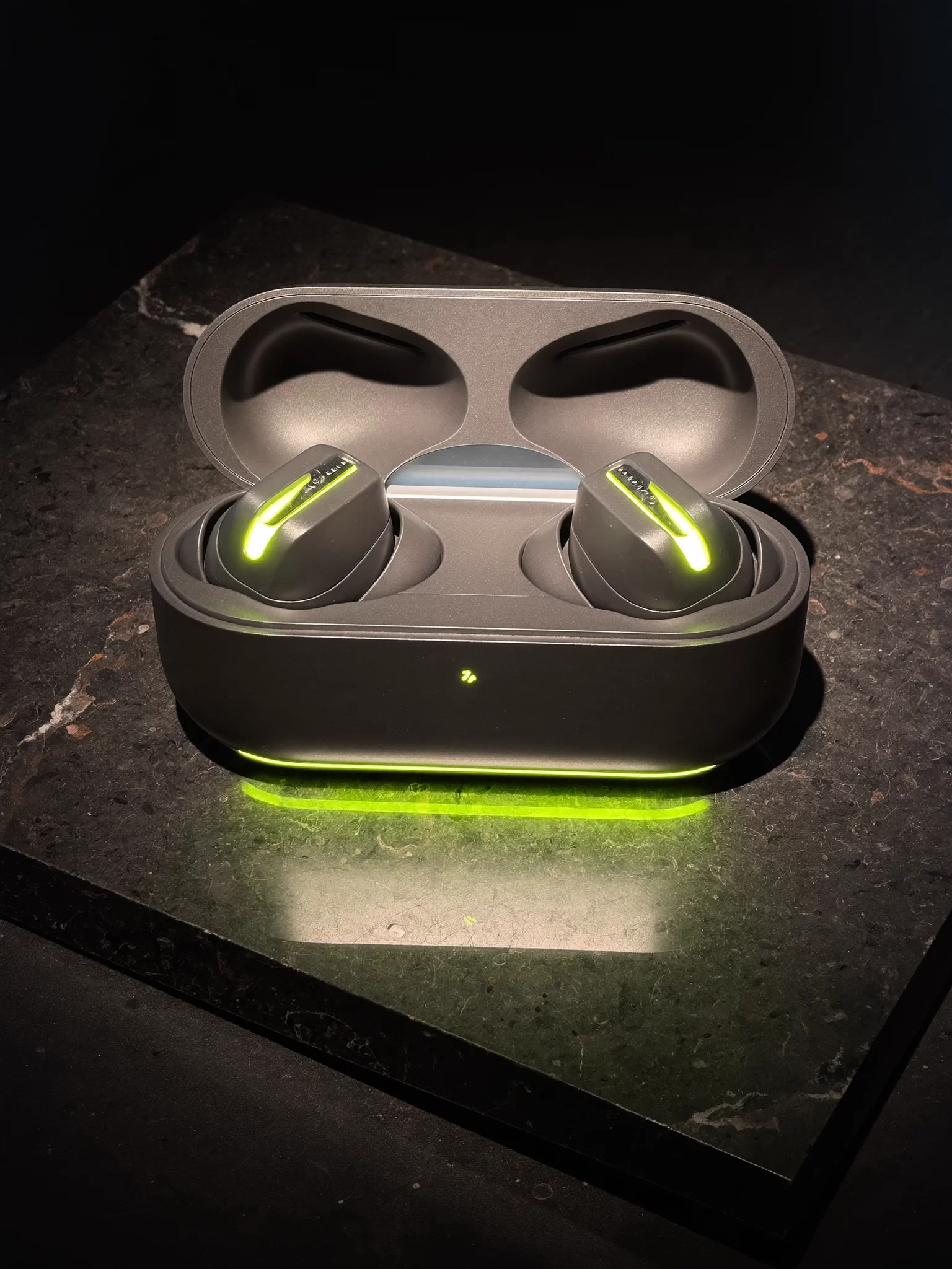
Electronics brands live on screens. Start-up animations, app loaders, charging indicators, the light strip on a speaker, the chime when earbuds connect. These tiny moments are repeated thousands of times a day and they are brand assets, whether anyone designed them or not. We define a motion and sound language alongside the visual identity, so the product, the app, the social film and the launch video all move in the same way. Our Studio is exploring this in Voltre, an audio and electronics concept brand that is still in development, built around a single electric lime line of light.
Where should an electronics brand start?
Usually with the one decision everything else depends on: who the product is for and why they should choose it. With that settled, the name, the box, the listings and the launch plan fall into place quickly. Without it, each asset argues with the others. If you have a launch date already, we start with a short positioning sprint and build the rest in parallel. If you are refreshing an existing range, we start with an audit of what buyers see today.
Electronics packaging design that works in the courier bag
Electronics packaging design has to protect something fragile, carry certification marks and mandatory information supplied by your compliance team, survive a courier and still feel like a gift. We work with your converter on inserts, closures and materials, cut plastic where we can, and design the reveal so the product is the first thing the camera sees. Read more on our packaging design approach, and on media planning and buying, which we run on a flat fee, never a percentage of your spend.