A shopper opens a chiller door, looks for about three seconds and closes it with a bottle in hand. Whether that bottle is yours has very little to do with your recipe and almost everything to do with what she saw first. The colour, the shape, the one word she could read through frosted glass. As a food and beverage branding agency, we design for those three seconds, and for the 200-pixel square on a quick commerce app where the same decision now happens on a phone.
We work with beverage brands, snacks, dairy and frozen, pantry staples, confectionery, gourmet and speciality foods, and FMCG businesses with ranges that have grown faster than their design system. From a founder with one soda to a food company with a hundred SKUs.
Food and drink is also the category where a brand has the least time and the most competition. There is no salesperson in the aisle, no demo, no second visit. The pack, the listing and the first sip have to do all of it, which is why we treat every decision, down to the colour of a cap, as a sales decision.
Winning the chiller door and the shelf
A chiller is a hostile place for packaging. Cold glass, condensation, poor lighting, bottles crammed in rows with only the top third visible. A supermarket shelf is not much kinder: forty competitors, shelf-edge labels over your logo, promotional stickers everywhere.
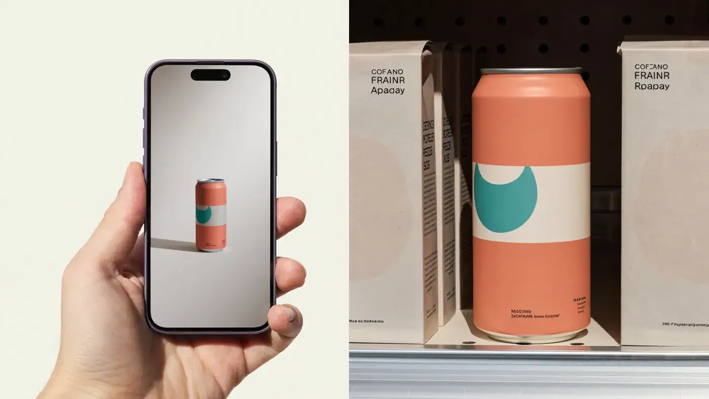
Our beverage packaging design starts with those conditions. We work out what shows when only the neck of a bottle or the top of a can is visible. We choose colours that hold up behind glass and under fluorescent light. We give every pack one dominant shape or colour that a regular can find without reading. Then we photograph the routes in a real chiller and on a mocked-up shelf beside your actual competitors, before a single dieline is approved.
Range architecture: how a range should read
Most F&B brands add products one at a time, and after three years the range looks like a family where nobody has met. The lemon is yellow, the mango is also yellow, the new low-sugar line uses a different typeface, and the gift pack was designed by someone’s cousin.
Range architecture fixes that. We decide what stays constant across every pack (the brand block, the structure, the typeface) and what changes (flavour colour, illustration, claim). We decide how sub-ranges sit: a premium line, a kids’ line, a sugar-free line, a seasonal edition. The result is a system your production team can extend without breaking it, and a shelf that reads as one brand from the end of the aisle.
Appetite appeal: making people hungry at 200 pixels
Appetite appeal is the oldest rule in food packaging and still the one most often broken. A pack has to make someone want to eat or drink the thing inside it. That means real textures, real ingredients, light that feels warm, and the right amount of mess: a drop of condensation, a crumb, a glossy pour.
We direct food and drink photography, and our Studio produces AI product photography for concepts, listings and social content. We show the product honestly. If the serving suggestion includes things not in the pack, the pack says so, and we never make the food look bigger or more generous than what the customer will actually get.
Can a regular find your can in the chiller without reading?
Test your pack with usQuick commerce and marketplace thumbnails
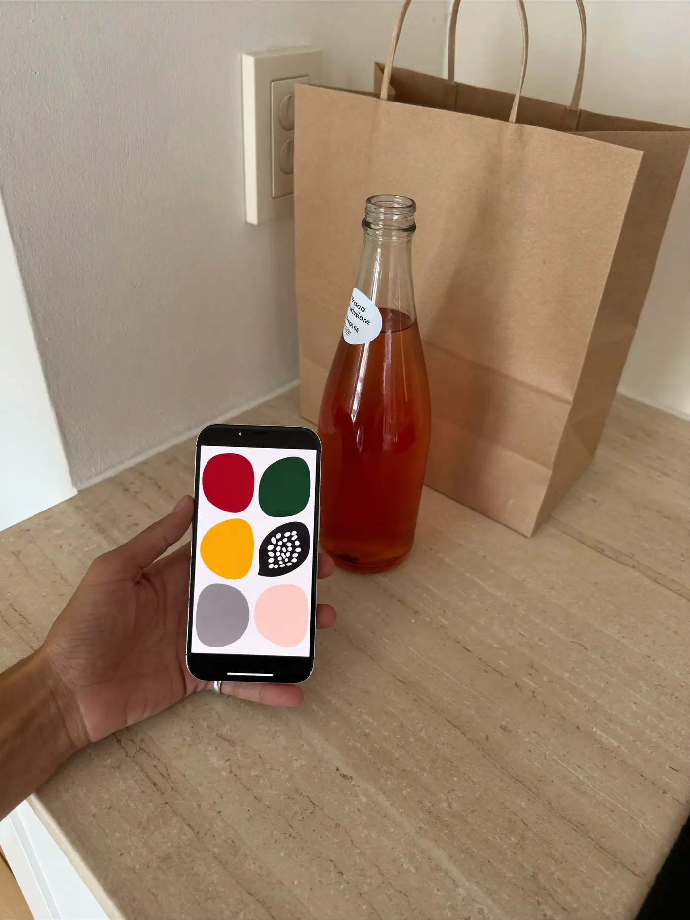
On Blinkit, Zepto, Instacart, Amazon Fresh, Talabat or any grocery app, your product is a small square in a scrolling grid, next to a dozen near-identical options, bought in the time it takes to wait for a lift. Thin type disappears. Pale colours wash out. Beautiful illustration becomes noise.
- Recognisable before readable. A dominant colour or shape that survives compression.
- Pack size you can see. Nobody wants to discover a 150 ml can was not a 330 ml one.
- Variant coding by colour, so flavours read as one family in search results.
- Listing image sets designed with the pack: hero, flavour, ingredients, serving, multipack.
We check every design on a phone at real listing sizes before it goes to print. Good SEO and AI search work then helps people find you when they search for the drink, not the brand.
Naming, voice and the back of the pack
The front of the pack gets the attention. The back of the pack gets read, usually at home, sometimes while waiting for the kettle, occasionally aloud to someone else at the table. It is one of the few places a food brand gets a quiet minute with its customer, and most brands fill it with a paragraph nobody finishes.
We write back-of-pack copy that sounds like the brand: where the fruit comes from, why the recipe is the way it is, what goes well with it, a small joke if the brand has a sense of humour. We also name products and ranges so they are easy to say, easy to search and hard to confuse with the competitor on the next shelf. A good flavour name does half the work of the illustration. A clear sub-range name tells a shopper in one word whether this is the everyday one or the special one.
Launch campaigns for a new drink brand
A new drink brand has to earn trial fast, usually with a modest budget and a sales team pushing for distribution at the same time. We plan launch campaigns that work at the point of purchase first and in media second: sampling moments, cooler branding, shelf-edge material, social content, a short film and a media plan on a flat fee, never a percentage of your spend.
We think in seasons. Summer for cold drinks, monsoon for hot snacks, the wedding season, cricket, exams, the long weekend. A good F&B calendar follows the reasons people eat and drink, not the brand’s financial year.
Festive gifting and hampers
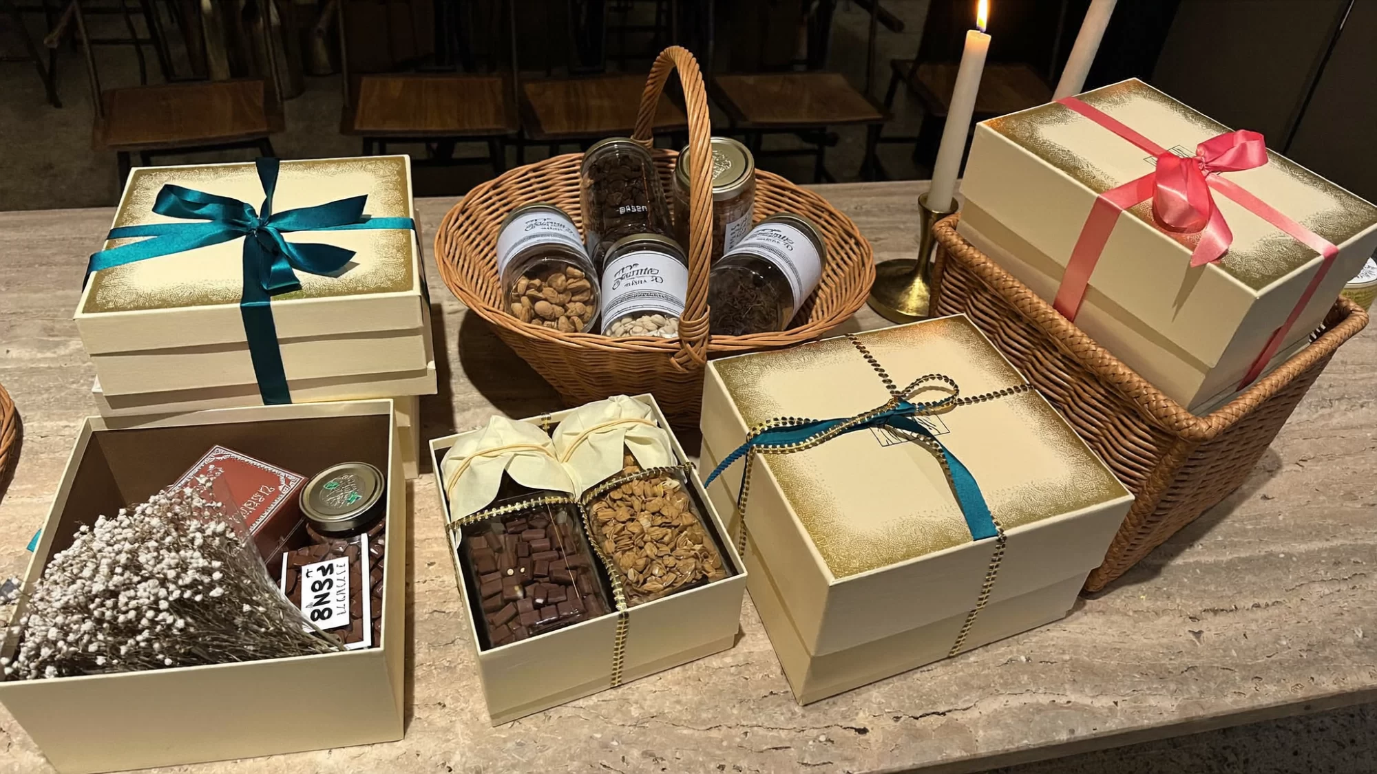
For many food brands, the festive season is where the year is made. Diwali, Eid, Christmas, Lunar New Year, Onam, corporate gifting in December. Gifting packs are bought by one person and opened by another, often in front of family, and the box has to look generous without being wasteful.
We design gift boxes, hampers and limited editions as part of the range architecture, so the festive pack feels special while clearly belonging to your brand. We plan them early, because rigid boxes and special finishes need longer lead times than anyone expects in August.
Packaging for export markets
Taking a food brand abroad means new shelves, new competitors and new artwork. Languages, units, nutrition panel formats and importer details vary by market. We build artwork systems with space for those changes, so a new market is an adaptation, not a redesign. Mandatory information is designed from content supplied and approved by your regulatory and quality teams, and local-language copy is handled by native-speaking colleagues and specialists. We do not handle product registration, regulatory filing or distributor negotiations.
From our Studio: concepts, not clients
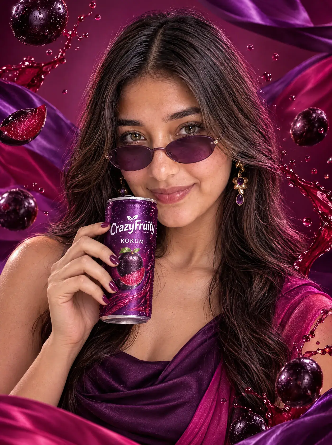
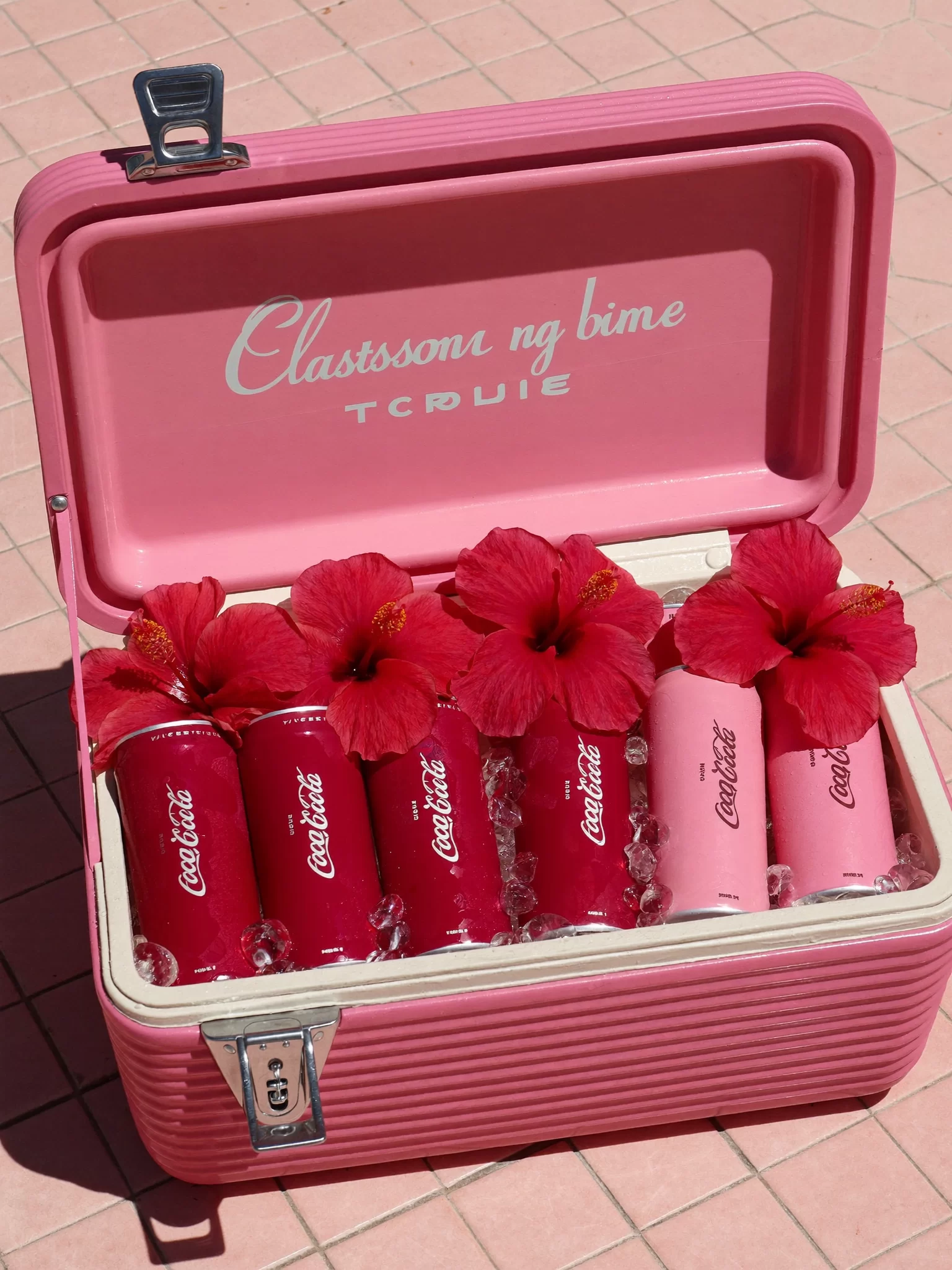
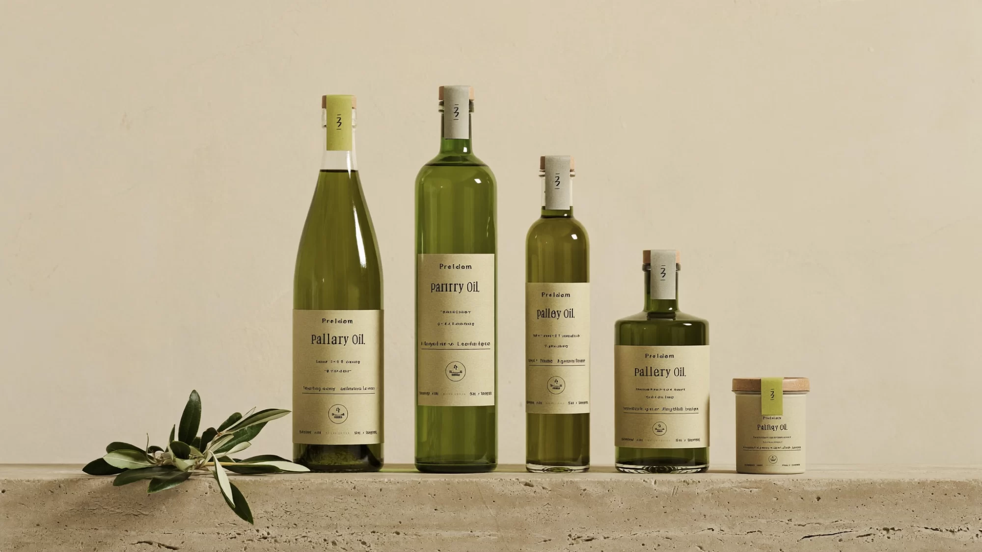
Our Studio builds F&B concept brands to test ideas we would bring to a real brief. CrazyFruity is an Indian fruit soda concept led by kokum. Hibis Juice is a hibiscus soda concept built around the cooler and the six-pack. Olive Orchards Pantry is an olive oil concept about slowness and stone. We have also made concept films for invented brands such as Olive Bouquet and Golf County. None of these are clients. They show how we think.