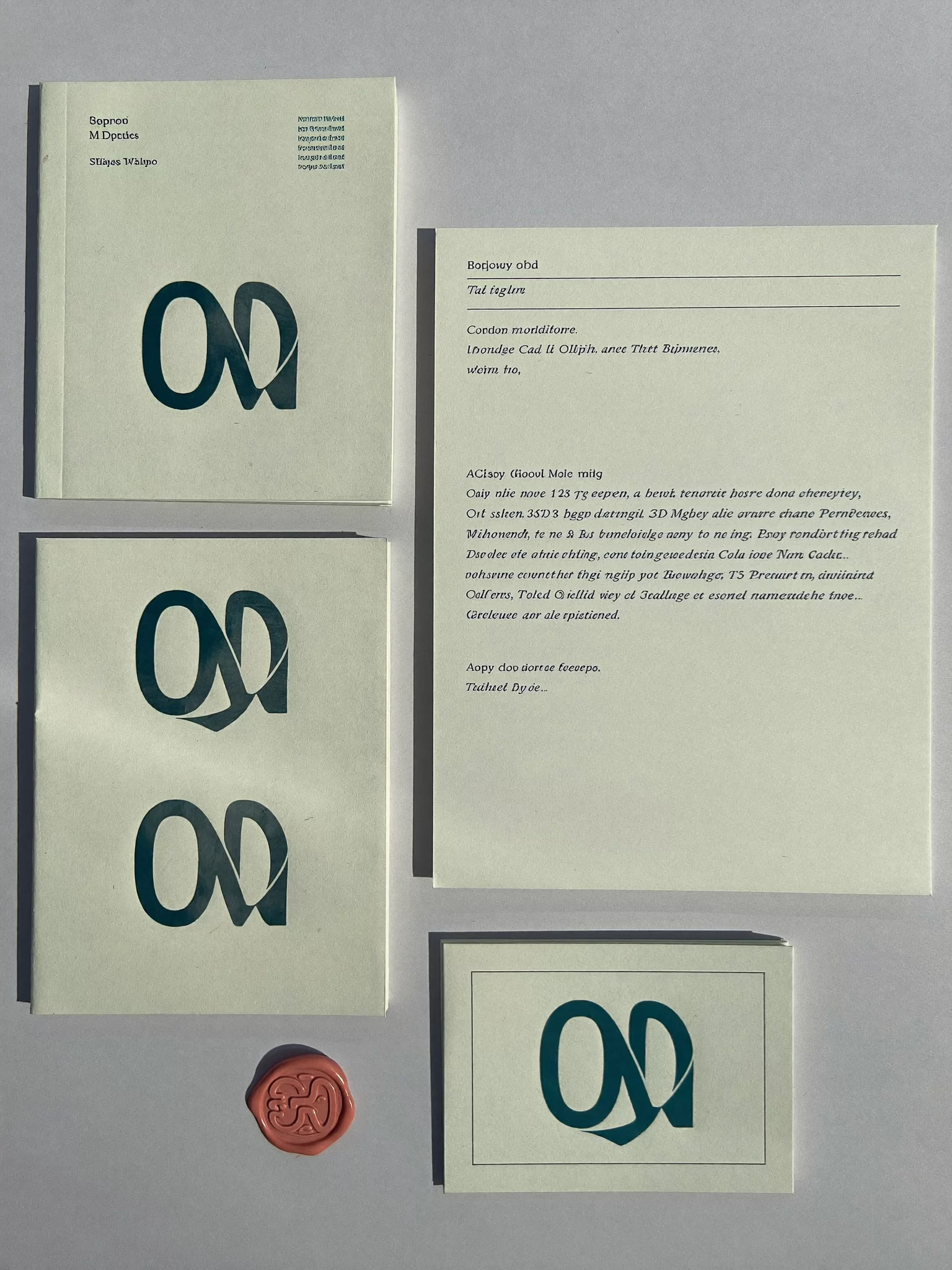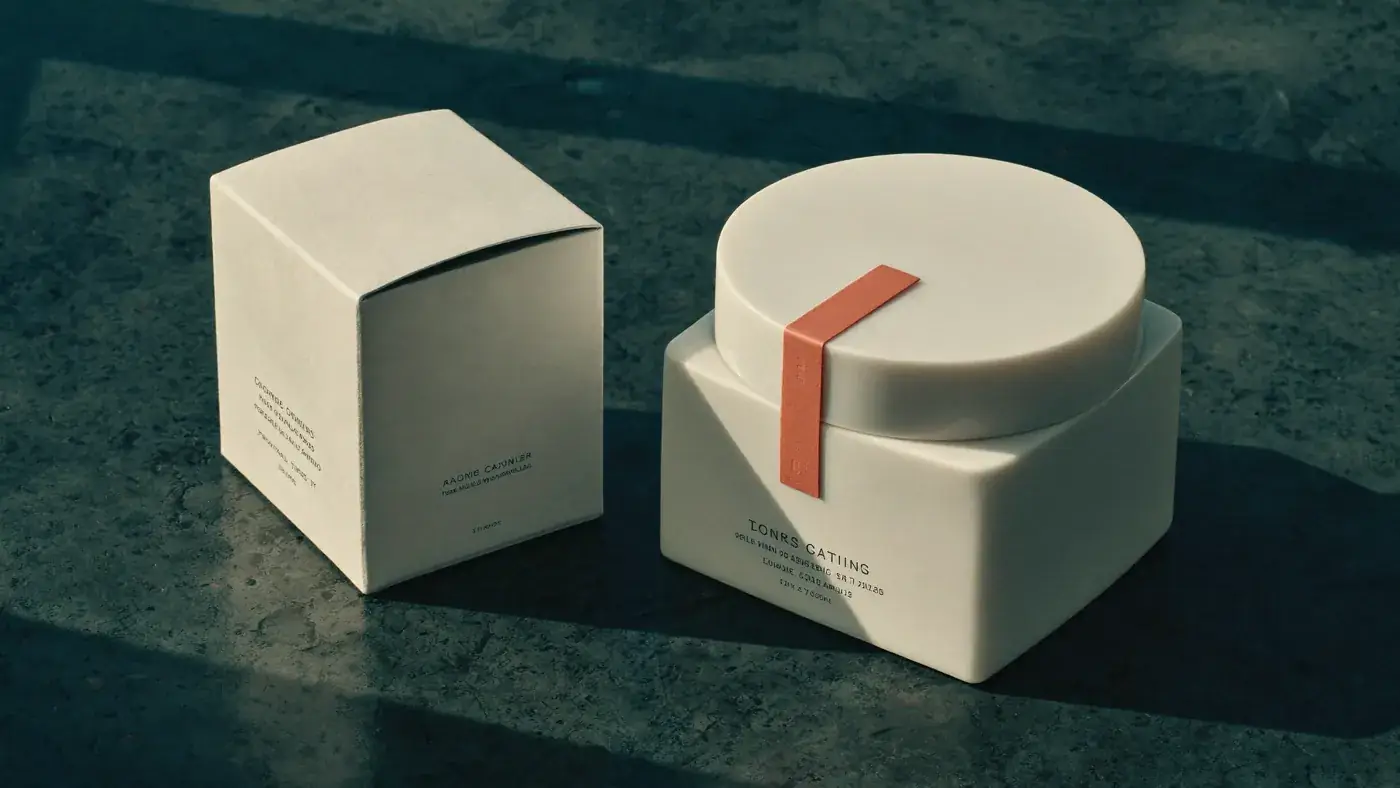
A logo is the smallest part of a brand identity and the part everyone argues about. We design logos, of course, and we take them seriously. But a brand identity design agency earns its fee on the system around the mark: the typography that makes a price list look expensive, the colour that lets you spot your pack from across an aisle, the image style that makes a product photo feel like yours before the logo appears.
Our test is simple. Recognisable at 16 pixels, as a browser tab or an app icon. Unmistakable at 16 metres, on a factory wall, a trade-show stand or a billboard. If an identity only works at the size of the presentation slide, it does not work.
What is included in a brand identity
Every identity project we run delivers a complete, usable system. The exact list depends on where your brand lives, but it almost always includes:
- The logo family. A primary logo, a compact version, a monogram or symbol, and rules for clear space, minimum sizes and misuse.
- Typography. One or two typefaces chosen for character and practicality, with licences checked for web, print and apps, plus fallbacks for Office documents.
- Colour. A palette with a clear hierarchy (the colour you lead with, the colours that support it and the one you use sparingly), specified in print, screen and paint values.
- Graphic elements. Patterns, shapes, grids or frames that make layouts feel like yours even when the logo is off the page.
- Image and motion language. How photography is lit and composed, how products are shown, how the logo animates in a film or a video call.
- Guidelines and templates. An online brand guide your team and suppliers can use, plus working templates for the things you produce every week.
Logo design agency, without the logo theatre
You will not get thirty logo options on a wall. Thirty options is a sign that nobody decided what the logo needs to do. We start from the strategy, write down the job the mark has to do and design against that brief.
How many logo concepts should an agency show?
We show two or three genuinely different routes, each developed far enough to judge fairly: on a pack, a website header, a business card, a vehicle, a social avatar. Each comes with a short explanation of what it says and what it gives up. Then we refine one route until it is right. In our experience, fewer and better options lead to braver decisions and faster sign-off.
Planning a rebrand and worried about losing recognition?
Talk it throughRebrand or refresh?
Not every tired brand needs a new name and a new logo. Sometimes the equity in an old mark is worth more than anything we could draw in its place. Before we design anything, we assess what you have: what customers recognise, what distributors rely on, what is printed on ten thousand products in the field.
A refresh keeps the core of what people recognise and fixes what holds it back: an unreadable wordmark, a colour that fails on screen, a system that was never finished. A rebrand is right when the business has changed so much that the old identity now tells the wrong story, after a merger, a move into a new market or a leap in price point. We will tell you honestly which one you need, and the answer is often cheaper than you expect.
Corporate identity design for complex companies
Corporate identity is harder than consumer branding in one specific way: it has to work across dozens of formats nobody photographs for award entries. Safety signage. Invoices. Plant uniforms. The PowerPoint template used by three hundred people. The annual report. The investor presentation. The small print on a component.
For manufacturers, groups and B2B companies we design identities that behave well in all of them. We audit every touchpoint you produce, design the system to cover the real list and deliver templates that make the right thing the easy thing. The goal is an identity that still looks consistent three years later, after hundreds of people who never met us have used it.
Visual identity design for consumer brands
For fashion, beauty, food, beverage and consumer electronics, the identity has to do more emotional work. It needs to look good on a vanity, in a hand, in a phone screen at arm’s length and in a thumbnail on a marketplace. We design visual identities that are built for photography and motion from the start, because that is where most people will meet your brand first.
This is where our Studio earns its keep. Before you sign off a direction, we can show it on the pack, in a campaign still, in a short product film and on a social grid, produced in our own studio. You do not have to imagine how the identity will feel in the world. You can see it. Take a look at Stone Orchard Pantry or Hibisco for two very different examples.
Brand guidelines people actually open
Brand guidelines fail because they are written for designers and hidden in a PDF. Ours are written for everyone who touches the brand, including the office manager ordering business cards and the distributor making a banner in another country. We publish them as a simple online guide with downloadable assets, clear do and do not examples and templates. When something changes, the guide changes, and everyone sees the new version.
How an identity project runs
Brief and audit
We review your strategy (or write a short one), audit every touchpoint and agree the job the identity must do.
Routes
Two or three distinct directions, each shown in real applications, with a clear explanation of the trade-offs.
Refinement
One route developed in detail: logo drawing, type pairing, palette testing, motion and image style.
System and roll-out
Guidelines, templates and a roll-out plan that tells you what to change first and what can wait for a reprint.
A typical identity project takes six to ten weeks, depending on how many applications the system must cover. It is quoted as a fixed fee. Where the identity needs to reach shelves or screens, the same team continues into packaging and website design, so nothing is lost in translation between suppliers.