The campaign looked wonderful in the presentation. Then it had to fit a phone screen. The hero image was wide, so the vertical crop cut the product out. The headline was eight words long, so the banner version shrank it to nothing. The regional team translated the line literally and it meant something faintly embarrassing. By the time the campaign reached the places people actually saw it, there were twelve versions of the idea and none of them was quite the idea.
Campaign art direction is the discipline that stops that happening. We take one concept and make it work everywhere it has to live: film, outdoor, print, social, display, retail, email and the landing page at the end of the click. We direct the casting, including AI talent that is always labelled as AI, and we adapt the meaning for every market the campaign enters, which is a bigger job than translating the words.
What does a campaign art director actually do?
The art director owns how the idea looks and feels, from the first sketch to the last resized banner. In practice that means deciding the visual world of the campaign (composition, colour, light, typography, casting, styling), turning it into a system other people can use, and checking every execution against it. Copy and image are developed together, so the line and the picture make one point rather than two.
For brands that run campaigns through several agencies or in-house teams, the art director is also the person who can say no. Without that role, every adaptation drifts a little, and the drift compounds.
We work as that role for brands that do not have one in house, or alongside a creative director who wants a second pair of eyes on execution. Either way, the output is the same: a concept that is written down, a set of master visuals, rules that explain the reasoning behind them, and a review routine that catches drift before it reaches the public. The rules are short on purpose. A forty-page guide gets skimmed; a six-page guide with clear examples of right and wrong gets used.
One concept across every format
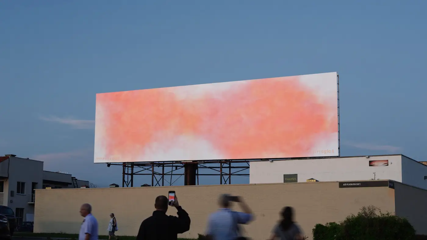
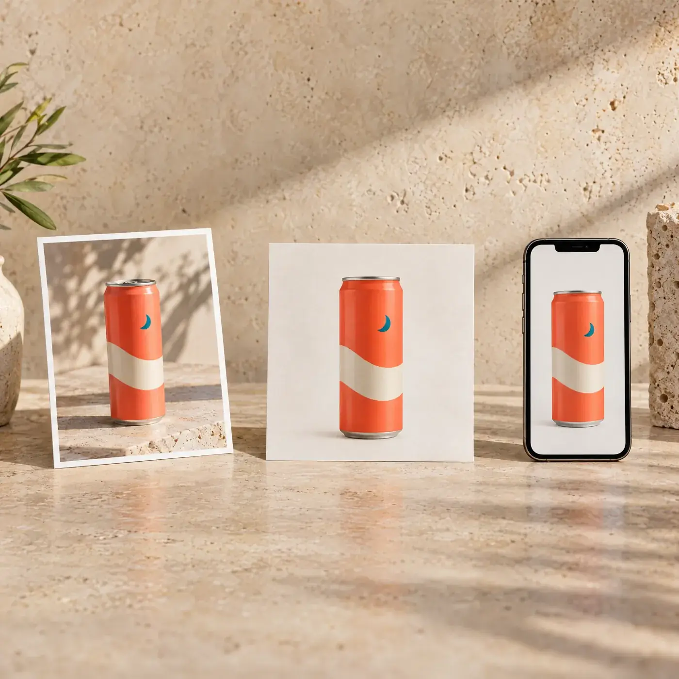
A strong concept should still be recognisable as a 15-second vertical video, a six-sheet at a bus stop and a 300-pixel square in a feed. We design for the hardest format first, usually the smallest or the most vertical, then work outwards. An idea that survives a phone screen will survive a billboard; the reverse is rarely true.
- Master frames shot or composed with every crop in mind, with safe zones marked for vertical, square and wide formats.
- A headline system with a long line, a short line and a one-word version, all approved together.
- Type and colour rules that stay legible over images, on dark and light backgrounds and at small sizes.
- An adaptation guide so media owners, retail partners and regional teams can produce new sizes without inventing new design.
This sits naturally alongside product launches and media planning, because the format list comes from the media plan. We would rather know the formats before we shoot than after.
Casting, including AI talent disclosed as AI
Casting decides whether your audience sees themselves in the work. We cast for the campaign’s idea and the markets it will run in, then direct wardrobe, styling and expression so the people in the images carry the brand rather than a stock photography mood.
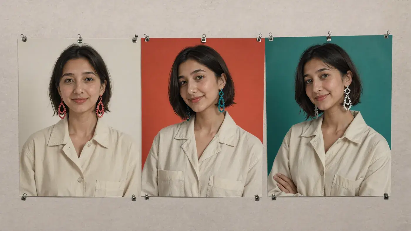
Our Studio also creates AI talent: consistent characters who can appear across a whole campaign, in any setting, without a location shoot. That is useful for concept testing, for fast-moving social content, and for categories where a physical shoot for every market is impractical. Our rules are simple. AI people are labelled as AI wherever they appear. They are never presented as real customers, real employees or real endorsers. They are never built to resemble a real person. Where real people are cast, usage rights are agreed in the contract for every market and medium.
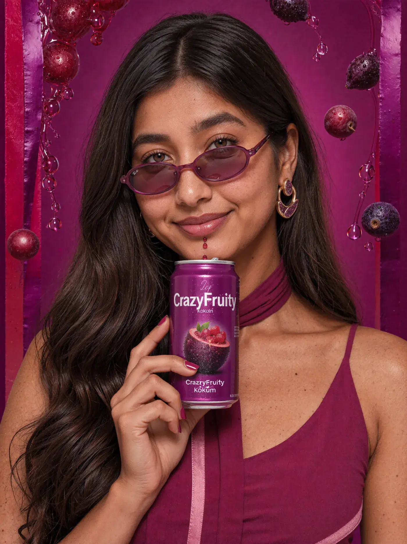
You can see how this works in our CrazyFruity concept, an Indian fruit soda brand we invented, with AI talent in its campaign imagery.
Localising meaning across markets
Translation changes the words. Localisation checks whether the idea still means the same thing. A gesture that reads as friendly in one country is rude in another. A colour that signals celebration in one market signals mourning elsewhere. A pun that works in English has no equivalent at all. And the order in which people want information, offer first or story first, varies by culture and by channel.
We split every campaign into what stays and what adapts. The identity, the core proposition and the approved offer stay stable. Idiom, examples, casting, information order and channel treatment are reviewed market by market by native-speaking colleagues and specialists. Then a proposition check confirms the adapted version still promises exactly what the original did, before a final review of the destination page in each language.
The questions worth settling before any of that begins are practical. Who owns the language in each market, and who has the final word on it? How familiar is the local audience with the brand or programme already, since a market meeting you for the first time needs more explanation than one that knows you well? Who reviews offer conditions and legal lines in each country? Answering those early prevents the most common localisation delay, which is a finished campaign waiting for an approval nobody knew they had to give.
Taking a campaign into a market where the context changes?
Send us the briefProduction: shoots, AI imagery and film
Some campaigns need a real shoot: the product in real hands, real texture, real light. Some are better made in the Studio with AI imagery and AI film. Most benefit from a mix, with the hero product photographed exactly and the surrounding world built digitally. We recommend the route that suits the idea and the budget, then direct it to one standard so the shot and the generated frames sit together without a visible seam.
The Studio has made short films for brands we invented to test this approach, which you can watch on our films page. Every concept brand is labelled as a concept. None of them is a client.
The campaign art direction process
Brief and formats
The proposition, the audience, the markets and the full list of formats from the media plan.
Concept routes
Two or three ideas, each shown at its smallest and largest format.
Casting and pre-production
Talent, real or AI, wardrobe, locations or digital sets, and a shot list built around every crop.
Production
Shoot, Studio work or both, directed against the key visual system.
Adaptation and localisation
Every size, every market, reviewed by native speakers and checked against the master.
How do you judge whether the art direction worked?
Beautiful is not a measure. We agree before launch what the campaign must achieve: recognition of the brand in the work, recall of the message, response in the channels that carry an action, and consistency across every execution. Where budgets allow, we test key visuals with a sample of the audience before full production. After launch, we compare formats and markets side by side, so the next campaign starts from evidence. Our approach is set out in how we measure.
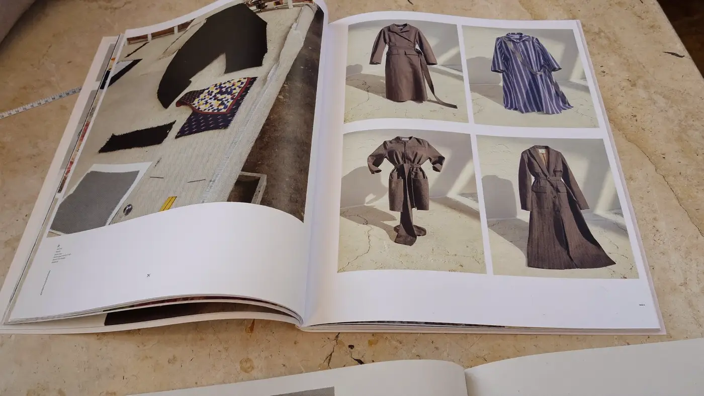
The case note below comes from our team’s experience in earlier in-house and programme roles, adapting a fashion retailer’s programme communication for a regional audience. It shows what localising the meaning looks like in practice.