You cannot hear earbuds on a phone screen. That single fact shapes everything about marketing audio. The thing you are proudest of, months of tuning, a driver you fought the factory for, is invisible at the moment of purchase. The buyer sees a small white or black case in a grid of small white or black cases, and a bass claim that reads exactly like the one beside it. An audio brand marketing agency has to make sound felt without being heard.
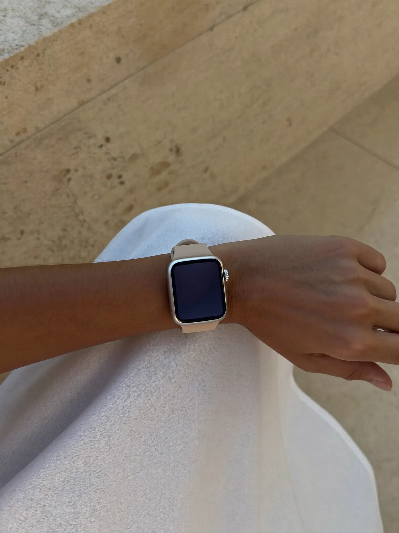
Wearables have the opposite problem. A smartwatch or fitness band is seen all day, on a wrist, in meetings and in selfies. It is closer to jewellery or eyewear than to a gadget, and people choose it partly for what it says about them. Both categories are worn. Both sit on the body. That is why we treat audio and wearables as fashion-adjacent, and brand them accordingly.
How do you market a sound nobody can hear?
You translate it. Every tuning has a character: warm and forgiving, bright and detailed, punchy and physical. Most brands flatten that into “rich bass and crystal-clear highs”, a phrase so common it has stopped meaning anything. We work with your acoustic engineers to describe the sound signature in words a listener recognises, then build images, colour, motion and film that carry the same feeling.
A warm, relaxed tuning might live in soft light, textured materials and slow camera moves. A bright, analytical one might live in crisp edges, high contrast and precise type. When the visual world matches the sound, reviewers notice the consistency, and buyers who like that kind of sound find you faster.
Earbuds packaging design: a small box with a big moment
Earbuds come in one of the smallest boxes in consumer electronics, and one of the most filmed. The unboxing has a natural three-act structure: the sleeve comes off, the case is revealed, the case opens to show the buds. Good earbuds packaging design plays to that sequence instead of burying the case under a tray of ear tips and paperwork.
- The case is the hero. It is the object the owner will handle hundreds of times, so it should be the first thing the camera sees.
- Ear tips and cables get their own quiet compartment, labelled by size so nobody tips them onto the floor.
- One printed line inside the lid can do more for the brand than a folded leaflet nobody opens.
- Paper-based inserts in place of plastic trays, which feel better and look better on camera.
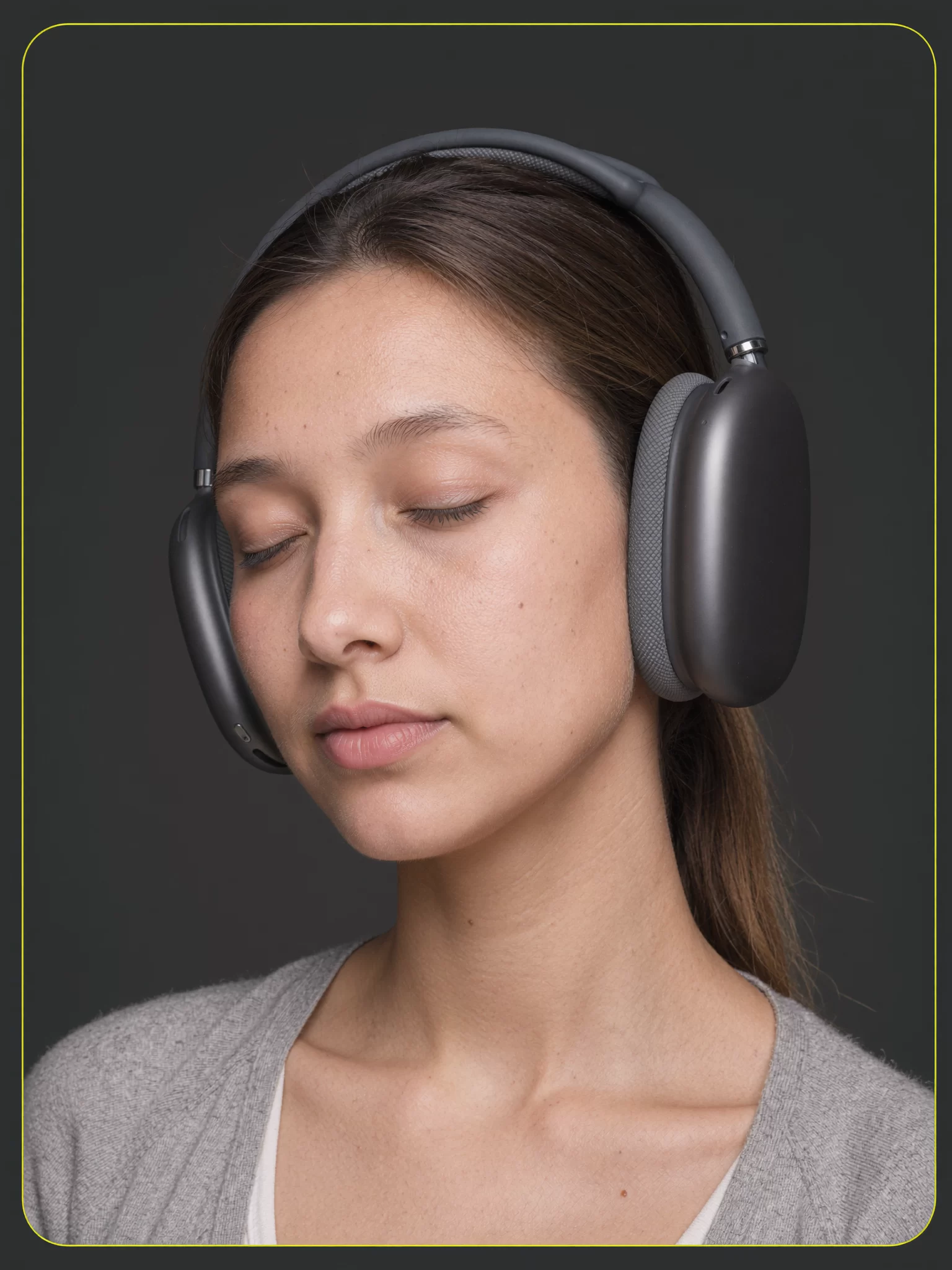
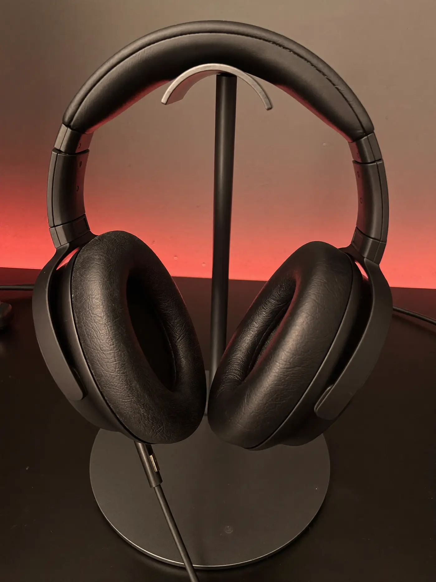
For over-ear headphones the box is larger and the moment is heavier: the lift of a rigid lid, the fold of the headband, the carry case. We design both, and the full detail of our method is on the packaging design page.
A headphone brand launch runs through reviewers
In audio, reviews carry more weight than almost any advertising. Listeners read measurement graphs, watch comparison videos and trust a few voices with years of credibility. A headphone brand launch has to respect that. We plan the reviewer programme first: who receives samples and when, what the reviewer guide explains about the intended sound and use, and how embargo dates line up with listings going live.
The reviewer guide is honest about who the product is for and who it is not for. That feels risky. In practice it earns better reviews, because a reviewer who understands the intent judges the product against the right benchmark. Paid media then amplifies the reviews that already exist, rather than trying to shout over them. Our media planning and buying is charged as a flat fee, so we have no reason to push spend before the reviews land.
Samples going out to reviewers soon? Let us write the guide they will actually read.
Brief us on the launchThe demo table: where sound finally gets heard
In an electronics store or a department store, audio has one advantage the marketplace lacks. People can listen. Yet most demo tables are an afterthought: a tangle of security cables, headphones hung at the wrong height, a looping track nobody chose, a tired card with the same bass claim as the box. The one place your tuning could win the argument often makes it lose.
We design the listening station as carefully as the pack. A short, deliberate playlist that shows off the sound signature in the first thirty seconds. Seating or standing height that lets people wear the headphones comfortably. One card that tells them what to listen for, in plain words. A quick way to compare with and without noise cancelling. And a clear route from the demo to the right box on the shelf, so the moment of conviction turns into a purchase before the shopper wanders to the next brand.
Wearables marketing agency thinking: the product is on a wrist for years
A smartwatch is a daily companion. The owner sees your brand every time they check the time, close a ring or glance at a notification. That means the product surfaces are the brand: the default watch face, the way the band clasps, the tone of a reminder, the charging animation, the app’s first screen. A logo on the box is the smallest part of it.
As a wearables marketing agency we design these surfaces alongside the product team. Watch faces with a recognisable signature. Strap ranges named and coloured like a fashion collection, so buyers come back for a second and a third. App copy that sounds encouraging rather than like a telemetry report.
Smartwatch marketing without overclaiming
Wearables often measure things people care about deeply: steps, sleep, heart rate, workouts. It is tempting to promise more than the sensors can honestly deliver. We write every feature claim from what your product and regulatory teams have tested and approved, describe wellness features as wellness features, and keep medical language out unless your experts supply and sign it off. Honest claims age well. Inflated ones end up in the comments of every review.
The strongest smartwatch marketing usually sells a feeling of control or a small daily win, shown through real routines: an early run, a calm commute, a reminder to stand that arrives at the right moment. That is where our Studio earns its place.
Lifestyle imagery that looks like a fashion shoot
Because audio and wearables are worn, the imagery has to meet fashion standards. Poor styling, awkward fit or a generic stock model make a premium product look cheap. Our Studio produces product stills, short films and portraits with consistent AI talent, always disclosed as AI, so a brand can show its headphones or watch on the same recognisable face across a whole season of content. Where a physical shoot is better, we direct it with photographers.
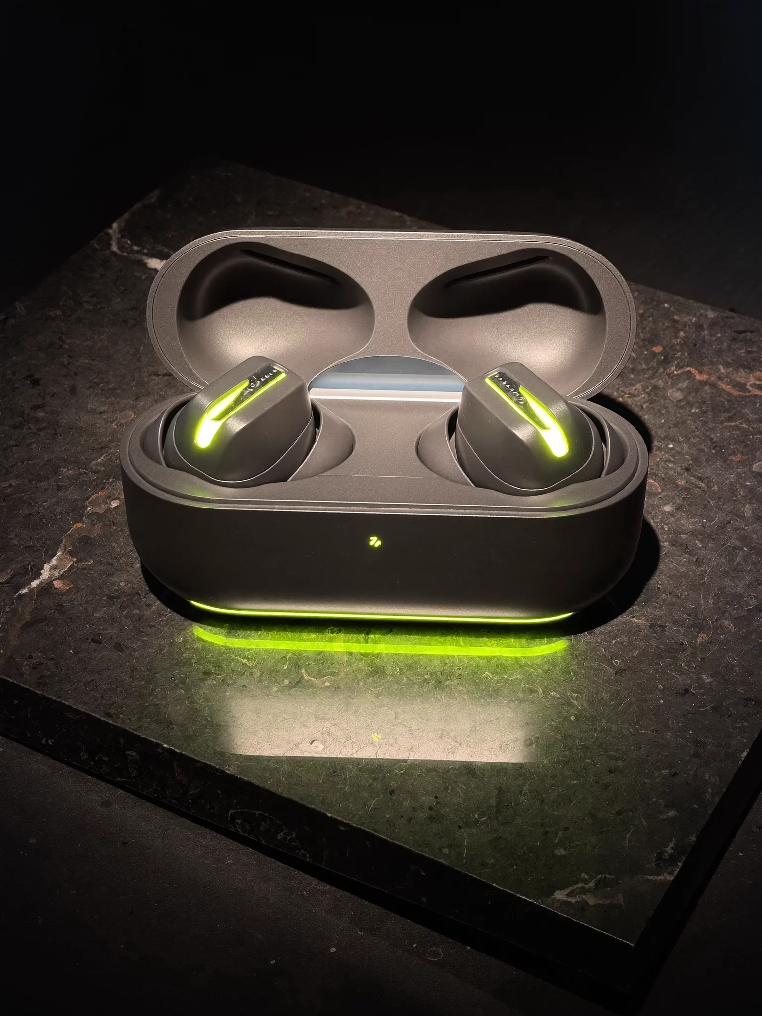
This is also where we test new ideas. Voltre, an audio and electronics concept brand still in development, is our own playground for sound-led identity: graphite surfaces, a single electric lime light line, and motion built around the moment earbuds connect.
Standing apart in a sea of identical buds
Distinctiveness in audio rarely comes from the product shape, which is largely dictated by ears. It comes from colour, material, sound character, the name and the way the brand talks. We build a brand identity that makes your case recognisable when it sits on a café table next to three others. For the shared launch, retail and marketplace thinking across categories, see the consumer electronics overview.