A clothing retailer already has plenty of reasons to be in a customer’s inbox. New collections, seasonal promotions and store updates all compete for the same few seconds of attention. A loyalty message adds one more. If it reads like a separate financial product, customers skip it, even when it could help them finish a purchase they already wanted to make.
The experience record names an American apparel retailer within a loyalty marketing portfolio that our team worked on. It does not break out a standalone campaign or result for that account. This note therefore sets out the approach we would take to the brief, built on the documented programme context: client-specific strategy, customer experience, email, paid media and reporting. The question at its centre is simple to state and hard to execute. How do you introduce a rewards option without interrupting the shopping?
The shopper’s next question
What is available?
One sentence on what the reward lets them do, in shopping language rather than programme language.
Does it apply here?
Whether it covers the items in front of them, and what happens if the balance does not cover the whole basket.
What happens next?
Where the option appears, and whether they need to sign in somewhere else to use it.
Start with the purchase, not the programme
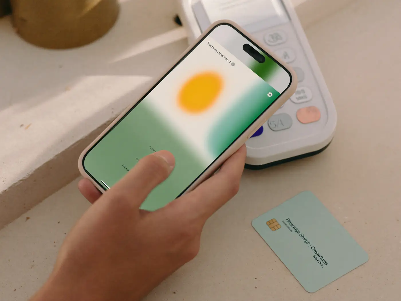
We would begin with the purchase situation. Someone is browsing everyday clothing, comparing sizes, or looking at a basket and deciding whether to commit. At that moment a rewards message has one job: help them understand an option that is available to them. It should not ask them to learn the full programme structure before they can carry on shopping.
That changes the writing. The headline can earn attention, but the supporting copy must answer the three questions above, in that order. Is the offer available on the selected items? What happens if the balance is not enough? Is there a separate account to deal with? An advertisement has room for perhaps one of those answers. The rest belong on the landing page, which is why we treat the page as part of the creative rather than something the web team handles later.
A useful exercise before any copy is written is to list every question a shopper might reasonably ask, then give each one a home. Some go in the subject line, some in the email body, most on the destination, and the conditions go wherever the shopper will look for them on a phone. The advertisement stays short because the page is doing its share.
Keep the retailer’s look in charge
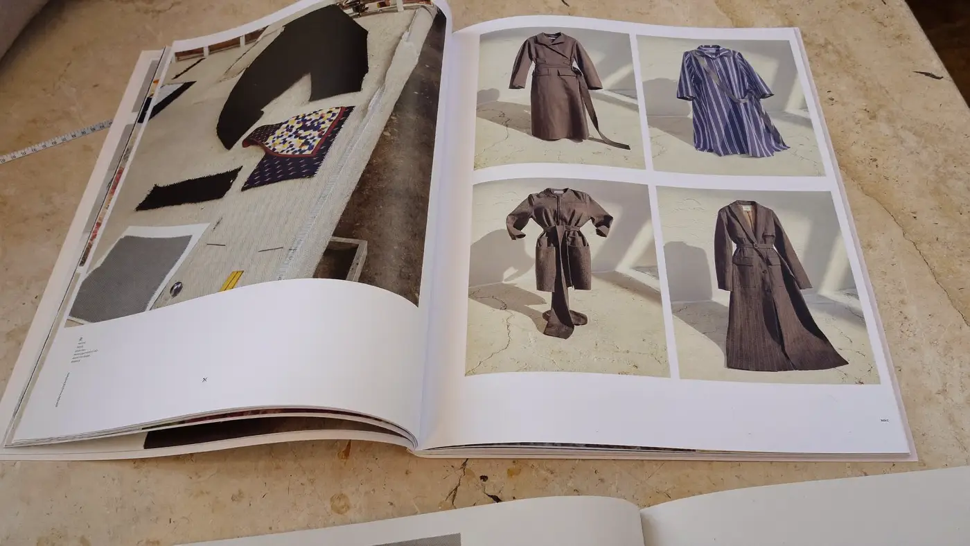
Apparel marketing relies on visual familiarity. Customers recognise a retailer’s photography, its type and the way it talks before they read a word. Programme creative should be built inside that environment, with the reward explanation visible but never louder than the clothes.
This is where brand compliance becomes a commercial discipline rather than a box to tick. The customer needs to recognise the retailer and see why the message is relevant to them. The programme partner needs accurate visibility. Legal and operational teams need the conditions presented clearly. Resolving all of that in a single asset is design work, and it goes badly when the conditions are pasted in at the end.
Email to destination layout Example
| Zone | In the email | On the destination page | Why it sits there |
|---|---|---|---|
| Product story | Collection photography and a short line in the retailer’s own voice | The same photography at the top, so the click feels continuous | The clothes are the reason to open and the reason to stay |
| Programme explanation | One sentence on what the reward lets the shopper do | How it works, where it applies and what happens with a partial balance | Short where space is tight, complete where the decision is made |
| Action | A single button that names the next step | The same next step, visible without scrolling on a phone | The promise in the email should match what the page lets you do |
The example uses placeholders rather than any real asset. Its purpose is to show where each piece of information should live, not what the retailer’s campaign looked like.
Different messages for different readiness
A first-time participant needs reassurance and basic instructions. Someone who has already used the programme needs a reminder tied to a relevant shopping moment. An inactive subscriber may respond to a clearer explanation of why the option is useful, not another generic announcement. These audiences should not receive identical messages simply because they share a list.
Message priority by audience
First participation
Lead with what the option is and how to use it once. Answer the partial-balance question early, because it is an obvious point where a first attempt can stall. Keep the product story present so the message still feels like the retailer.
Returning participant
Skip the explanation they already have. Tie the reminder to a shopping moment that suits them, such as a new season in a category they have bought from, and take them straight to it.
Inactive audience
Assume they have forgotten why the option matters. Explain its usefulness plainly, address one common source of doubt and offer a single route back, without the urgency of a launch message.
The sequence matters as much as the segments. An introductory message presents the option. A destination page explains participation. A follow-up deals with common uncertainty or points the customer back to the relevant category. Social and paid media introduce the proposition to suitable audiences, while email carries more detailed guidance to people who have already shown interest. For returning customers this becomes lifecycle messaging for returning customers, where timing and relevance count for more than volume.
Make the page do its share of the work
Campaigns often lose customers between the advertisement and the transaction. A strong click rate can hide a weak destination, and a lower-volume message can produce better participation if it reaches people at a more useful moment. So the review of the landing page sits inside the campaign plan. This is the part of improving the commerce journey that most programme campaigns skip.
- Does the page look like the promise in the email or advertisement?
- Can a visitor see the next step immediately, on a phone, without scrolling?
- Are the conditions readable at phone size, in plain language?
- Does the page make sense to someone who never read the earlier message?
- Does it hand the shopper back to the clothes once the reward is understood?
The same discipline applies in other categories, but the decision feels different. A shopper choosing between two televisions weighs the reward against a larger, slower purchase; we compare that situation in electronics retail.
An evaluation the retailer can act on
Reporting should keep audience response separate from purchase attribution. They answer different questions and they are rarely held in the same system.
Two kinds of evidence
Did people notice and arrive?
Delivery, opens where they are reliable, clicks and visits to the destination. Useful for judging the audience and the message. Not evidence that anyone bought anything.
Did people use the option?
Recorded participation, and purchase completion or basket behaviour where transaction data is available and properly linked. Where it is not available, the report says so.
The portfolio-level subscriber figure from the wider programme belongs to the umbrella account of the loyalty programme system, not to this retailer. This account should carry only its own verified figures if they are supplied later. Until then, the note shows the thinking without inventing a conversion rate or claiming any share of the retailer’s growth.
The value of the approach is that the reward starts to feel native to shopping. Brand strategy keeps the communication recognisable, copy turns participation into an understandable action, and a careful review of the page removes uncertainty. The clothing remains the reason to shop. The programme becomes a useful way to finish.